


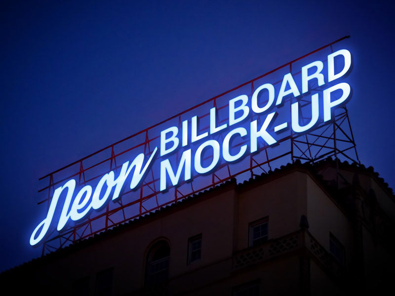
Color plays a decisive role in how outdoor signage is perceived, especially in environments filled with competing visual elements. For businesses relying on storefront visibility, choosing the right lighting colors can significantly influence how quickly and effectively a message is noticed. Neon-style signage is particularly powerful in this regard because it allows for a wide range of vibrant, customizable color options.
A well-planned color strategy does more than enhance aesthetics—it directly impacts readability, brand recognition, and customer engagement. This is why selecting the right custom outdoor neon sign design is closely tied to understanding how different colors behave in various lighting and environmental conditions.
A carefully designed custom outdoor neon sign helps businesses ensure that their storefront remains visible, recognizable, and visually appealing both day and night.
Why Color Matters in Outdoor Neon Signage
Color affects human perception in powerful ways. In outdoor environments, where lighting conditions constantly change, certain colors naturally stand out more than others. Bright and high-contrast colors tend to capture attention faster, while softer tones create mood and atmosphere.
For business signage, color choices influence:
- How quickly the sign is noticed
- How easily the text can be read from a distance
- The emotional response of potential customers
- Overall brand memorability
Because of this, color selection should always be based on both branding goals and visibility performance.
High-Visibility Colors for Outdoor Use
Some neon colors are inherently more visible in outdoor settings due to their brightness and contrast against common backgrounds like concrete, glass, and nighttime skies.
The most effective high-visibility options include:
- Bright white: Offers maximum readability and clean visibility
- Electric blue: Stands out well in both urban and dark environments
- Neon green: Highly eye-catching and uncommon in natural surroundings
- Vibrant red: Creates urgency and strong emotional impact
- Warm yellow: Enhances warmth and friendliness while remaining visible
These colors are often used for storefronts that rely heavily on foot traffic and quick customer engagement.
Psychological Impact of Neon Colors
Color is not just about visibility—it also influences how customers feel about a business. Different neon shades can communicate different brand messages without using words.
For example:
- Red tones often suggest urgency, energy, or excitement
- Blue shades convey trust, professionalism, and calmness
- Green is associated with freshness, nature, or sustainability
- Pink and purple create a modern, creative, or playful identity
Understanding these associations helps businesses align their signage with their brand personality more effectively.
Contrast and Background Considerations
Even the brightest neon color can lose impact if it does not contrast well with its surroundings. The background of a storefront plays a major role in how visible a sign appears.
To improve contrast:
- Use light colors on dark walls and vice versa
- Avoid similar tones between signage and building surfaces
- Consider nighttime visibility rather than daytime appearance alone
- Test color combinations under different lighting conditions
Strong contrast ensures that signage remains readable from various distances and angles.
Matching Colors with Brand Identity
Consistency between signage and brand identity is essential for recognition. A neon sign should not only attract attention but also reinforce the business’s visual identity.
Best practices include:
- Matching neon colors with logo design elements
- Maintaining consistency with interior branding
- Using one or two primary colors for clarity
- Avoiding overly complex color combinations
A cohesive color strategy strengthens brand recall and creates a more professional appearance.
Outdoor Lighting Conditions and Color Performance
Environmental conditions can significantly affect how neon colors appear. Daylight, street lighting, and weather conditions all influence visibility.
Important considerations include:
- Bright sunlight may reduce the impact of softer neon tones
- Fog or rain can enhance glow but reduce clarity if contrast is low
- Urban lighting may compete with signage brightness
- Nighttime conditions offer the best visibility for neon displays
Choosing colors that perform well across different conditions ensures consistent effectiveness.
Conclusion
Color selection is one of the most important factors in designing effective outdoor signage. The right neon colors can dramatically improve visibility, strengthen brand identity, and influence customer perception. Businesses must consider contrast, psychological impact, and environmental conditions when planning their signage strategy.
By carefully selecting the right combination of colors and design elements, a custom outdoor neon sign becomes more than just illumination—it becomes a powerful communication tool that enhances visibility and drives customer engagement in any location.


